ProTable
基于 antdv-next Table 的高级表格封装,集成搜索联动、分页、列显隐控制、尺寸切换等功能。
何时使用
- 需要通过配置生成表格而不是编写大量模板代码
- 需要集成搜索表单和工具栏
- 需要统一表格布局和样式
配合 useTable 使用
antdv-next-pro 导出了一个名为 useTable 的自定义 Hook,用于处理表格数据和列配置,配合 useTable 可以更轻松地使用 ProTable。
架构与数据流
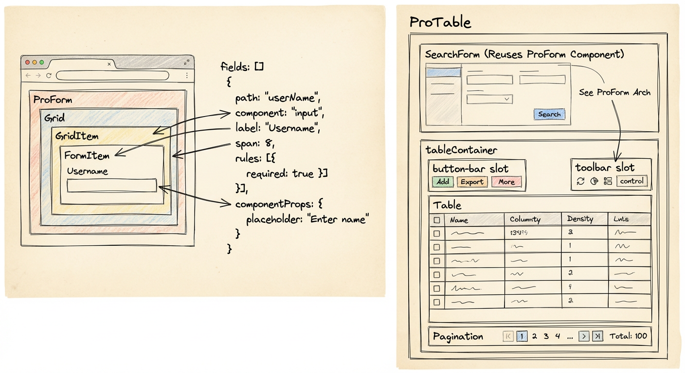
ProTable 的核心结构可以理解为三块:
ProTable负责整合 table props、搜索表单、控制按钮SearchForm基于ProForm渲染搜索字段UITable(antdv-next Table)负责最终表格渲染
数据流的核心路径如下:
useTable生成columns/dataSource/pageParam/searchFormProTable读取searchForm.fields决定是否展示搜索区域- 调用
search时触发加载,并根据分页更新再次请求 Table的onChange会同步pageParam并触发search
快速开始
最小使用步骤:
- 使用
useTable创建表格对象 - 传入
search方法并渲染ProTable
vue
<script setup lang="ts">
import { ProTable, useTable } from '@qin-ui/antdv-next-pro';

type Row = { name: string; age: number };

const table = useTable<Row>({
  columns: [
    { title: '姓名', dataIndex: 'name' },
    { title: '年龄', dataIndex: 'age' },
  ],
  searchFields: [{ label: '姓名', path: 'name', component: 'input' }],
});

const search = async () => {
  // 请求数据并更新 table.dataSource
};
</script>

<template>
  <ProTable :table="table" :search="search" />
</template>
API
Props
| 参数名 | 说明 | 类型 | 默认值 |
|---|---|---|---|
| table | useTable 返回对象 | Object | - |
| search | 表格数据查询获取方法 | Function | - |
| addIndexColumn | 是否添加索引列 | boolean | - |
| immediateSearch | onMounted 时立即触发一次 search 事件 | boolean | - |
| control | 是否展示表格 size 和 column 控制按钮 | boolean | | - |
| searchFormConfig | 搜索表单配置 | Object | - |
| tableContainer | 表格容器包裹组件,会渲染在 Table 外层,需要有 default slot | Component | - |
| v-model:size | 表格尺寸双向绑定 | 'large' | 'middle' | 'small' | - |
| v-model:loading | 加载状态双向绑定 | boolean | - |
| ... | 继承 antdv-next Table 组件的所有参数 | TableProps | - |
Slots
| 插槽名 | 说明 |
|---|---|
| search-form | 自定义搜索表单 |
| button-bar | 自定义按钮组 |
| toolbar | 自定义工具栏 |
| table | 自定义表格 |
列配置(Column)
Column 基于 antdv-next ColumnType 扩展而来,常用字段如下:
| 字段 | 说明 |
|---|---|
dataIndex | 列字段,支持路径数组 |
key | 列标识,默认由 dataIndex 推导 |
hidden | 是否隐藏该列 |
其余字段均继承 antdv-next ColumnType。
列控制配置(ColumnControlConfig)
control.columnControl 支持布尔值或配置对象,用于控制列显隐下拉的行为:
ts
type ColumnControlConfig<K extends string | number = string | number> = {
  /** 列在下拉中的显示名称映射,key 为列 key/dataIndex,用于 title 为 vnode 时无法正常渲染 */
  labels?: Partial<Record<K, string>>;
  /** 不在下拉中出现的列 keys(始终展示,不参与勾选) */
  excludedKeys?: K[];
  /** 在下拉中显示但不可取消勾选的列 keys(始终展示,始终勾选) */
  disabledKeys?: K[];
  /** 禁用全选/取消全选 */
  disableCheckAll?: boolean;
};
当 useTable 传入泛型时,labels/excludedKeys/disabledKeys 的 key 会获得与 dataIndex 一致的路径自动补全提示。
vue
<script setup lang="ts">
import { h } from 'vue';
import { ProTable, useTable } from '@qin-ui/antdv-next-pro';

type Row = { name: string; age: number; address: string };

const table = useTable<Row>({
  columns: [
    // title 为 vnode 时,通过 labels 提供下拉展示文本
    { title: h('span', { style: 'color: red' }, '姓名'), dataIndex: 'name' },
    { title: '年龄', dataIndex: 'age' },
    { title: '家庭住址', dataIndex: 'address' },
  ],
});
</script>

<template>
  <ProTable
    :table="table"
    :control="{
      columnControl: {
        labels: { name: '姓名' },
        excludedKeys: ['address'], // 不出现在下拉中,始终展示
        disabledKeys: ['age'], // 出现在下拉中但不可取消勾选
        disableCheckAll: true, // 隐藏全选
      },
    }"
  />
</template>
列显隐持久化(外部实现)
库本身不负责存储,使用方可通过 table.columns 与 table.setColumn 自行实现持久化(如按用户保存到数据库):
ts
// 保存:监听列 hidden 变化
watch(
  () => table.columns.value.map(c => c.hidden),
  () => {
    const state: Record<string, { hidden?: boolean }> = {};
    table.columns.value.forEach(column => {
      const key = column.key ?? column.dataIndex;
      if (key) state[String(key)] = { hidden: !!column.hidden };
    });
    api.saveUserColumnState(state); // 后端按 userId 存储
  },
  { deep: true }
);

// 恢复:进入页面从数据库加载后回写
const state = await api.getUserColumnState();
Object.entries(state).forEach(([key, { hidden }]) => {
  table.setColumn(key, { hidden: !!hidden });
});
搜索表单
searchFields
useTable 的 searchFields 复用 ProForm 的 Field 配置,用于生成搜索区域。
searchFormConfig
搜索表单的行为配置,常用字段:
| 字段 | 说明 |
|---|---|
layout | grid 或 inline |
expand | 是否可展开,或配置展开行数 |
hidden | 隐藏搜索表单 |
container | 搜索区域容器组件或 false |
searchButton | 自定义搜索按钮组件 |
resetButton | 自定义重置按钮组件 |
expandButton | 自定义展开按钮组件 |
rowGap | 行间距(px),默认 16 |
columnGap | 列间距(px),默认 24 |
其余字段会透传到内部的 SearchForm/ProForm。
自定义搜索按钮(作用域插槽)
search-button / reset-button / expand-button 三个插槽可完全自定义按钮内容。插槽出口不转发事件监听,操作方法与状态通过作用域参数暴露:
| 插槽 | 作用域参数 | 说明 |
|---|---|---|
search-button | { onSearch } | 触发查询 |
reset-button | { onReset } | 触发重置 |
expand-button | { expandStatus, changeExpandStatus } | 展开状态与切换方法 |
vue
<ProTable :table="table">
  <template #search-button="{ onSearch }">
    <a-button type="primary" @click="onSearch">查询</a-button>
  </template>
  <template #reset-button="{ onReset }">
    <a-button @click="onReset">重置</a-button>
  </template>
  <template #expand-button="{ expandStatus, changeExpandStatus }">
    <a-button @click="changeExpandStatus">{{ expandStatus ? '收起' : '展开' }}</a-button>
  </template>
</ProTable>
useTable
创建表格对象的 hook。
参数
| 参数 | 类型 | 说明 |
|---|---|---|
columns | Columns<T> | 初始列配置 |
dataSource | T[] | 初始数据源 |
pageParam | PageParam | 初始分页参数,默认 { current: 1, pageSize: 10, total: 0 } |
searchParam | DeepPartial<D> | 初始搜索参数 |
searchFields | Fields<D> | 搜索表单字段配置(复用 ProForm 的 Field) |
返回值
| 属性/方法 | 类型 | 说明 |
|---|---|---|
columns | Ref<Columns<T>> | 列配置数组(响应式) |
dataSource | Ref<T[]> | 数据源数组(响应式) |
pageParam | Reactive<PageParam> | 分页参数(响应式),包含 current、pageSize、total |
searchForm | Form<D> | 搜索表单实例(useForm 返回值) |
setColumn(key, column, options?) | - | 设置/更新列配置,支持 merge/rewrite;column 支持函数式 |
deleteColumn(path, options?) | - | 删除列,options.all 批量删除 |
appendColumn(path, column, options?) | - | 在指定列后追加,传 undefined 在末尾追加 |
prependColumn(path, column, options?) | - | 在指定列前插入,传 undefined 在开头插入 |
setPageParam(pageParam) | - | 设置分页参数,支持部分更新和函数式 (prev) => next |
resetQueryParams() | - | 重置分页和搜索条件到初始值 |
Types
Table:useTable的返回类型,包含columns/dataSource/pageParam/searchForm等Column/Columns:表格列配置类型,扩展ColumnType并新增hiddenFields:搜索表单字段类型(复用 ProForm 的Field)
扩展点与最佳实践(简版)
- 搜索表单复用
Field配置,复杂联动请参考 ProForm 的字段策略 - 使用
control开启列控制与尺寸切换 - 如需统一默认配置,可使用
ProComponentProvider注入pro-table